Best Practice: Brand Usage
The Riverty Badge
As a crucial element of our branding, the Riverty Badge should always be used in its approved form and consistently across various channels.
Difference between our Riverty Logo and the Riverty Badge
Our Riverty Logo is used in primary branding materials, while the Riverty Badge is used for marketing tasks. The guidelines for using our Badge ensure our brand remains consistent throughout the user journey and create strong visual recognition.
Usage of the Riverty Badge
The new Riverty Badge has been redesigned with slightly different dimensions to enhance readability. While we recommend using the new Primary Riverty Badge with its updated dimensions, we understand that some merchants may have strict checkout guidelines that prevent this. In such cases, you can use the Secondary Riverty Badge in its original dimensions.
When implementing the Riverty Badge, make sure you are using our URL and not downloading the image. The Riverty Badges are hosted on a Content Delivery Network (CDN) to ensure the best performance and availability for your website. You also do not have to keep track of changes or updates, which are all done by Riverty.
We provide two file types for our Badges through our CDN: .svg and .png. We recommend using the Riverty Badge as a .svg file for better quality and smaller file size. If you prefer .png, simply change the end of the URL to .png.
| Image Preview | SVG | PNG |
|---|---|---|
| | | |
| Image Preview | SVG | PNG |
|---|---|---|
| | | |
Dimensions and Spacing
For the Riverty Badge, there is a defined appearance with specific dimensions. However, there may be instances where the Riverty Badge needs to be adjusted to harmonize with other labels. In such cases, the Secondary Badge can be used. However, we prefer the use of our Primary Badge whenever possible.
Sizes
Adjust the height to match the other brand identities displayed in your payment flow. Don’t make the Riverty Badge smaller than other brand identities.
![]()
Clear space
The minimum clear space is defined by the height of the Riverty Badge. This clear space may be enlarged but should never be reduced.
For example, if the badge is 112 pixels high, the spacing should be 40% of the height, which is 44.8 pixels. Therefore, a minimum distance of 45 pixels should be maintained.
![]()
Appearance and Usage
Our Riverty Badge is key to our brand’s look. Here’s how to use it right.
Sharp Edges
Our Riverty Badge is always depicted with sharp corners. We do not use any roundings or blunt edges. This is a core element of our visual identity.
![]()
Improper use of our Riverty Badge
Love our Badge? So do we! That’s why we ask you to keep it as is and avoid any changes.
![]()
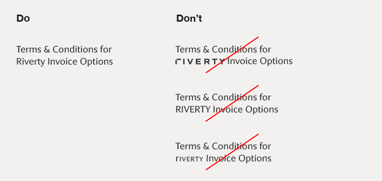
Using the name Riverty
When using the name Riverty in headlines or copy, always typeset Riverty with an uppercase R followed by lowercase letters. Never use the Riverty logo to represent the name Riverty in text. Set Riverty in the same font and typographic style as the rest of the text on your website. Don’t mimic Riverty’s typographic style.
Do you find this page helpful?