Best Practice: Sitewide Integration
Showcasing Riverty on the Product Page
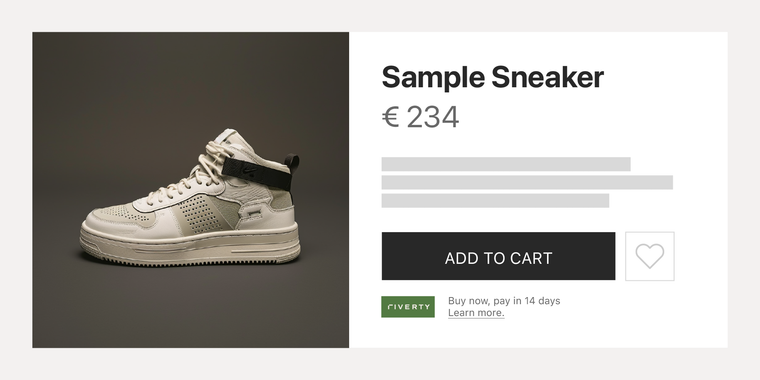
Riverty offers payment methods that many people recognize and feel safe with. Displaying our badge and payment methods on the product page, not just at checkout, has repeatedly been shown to increase sales.
- Use our Primary or Secondary Badge. You can find them here

Presenting Riverty at the Checkout
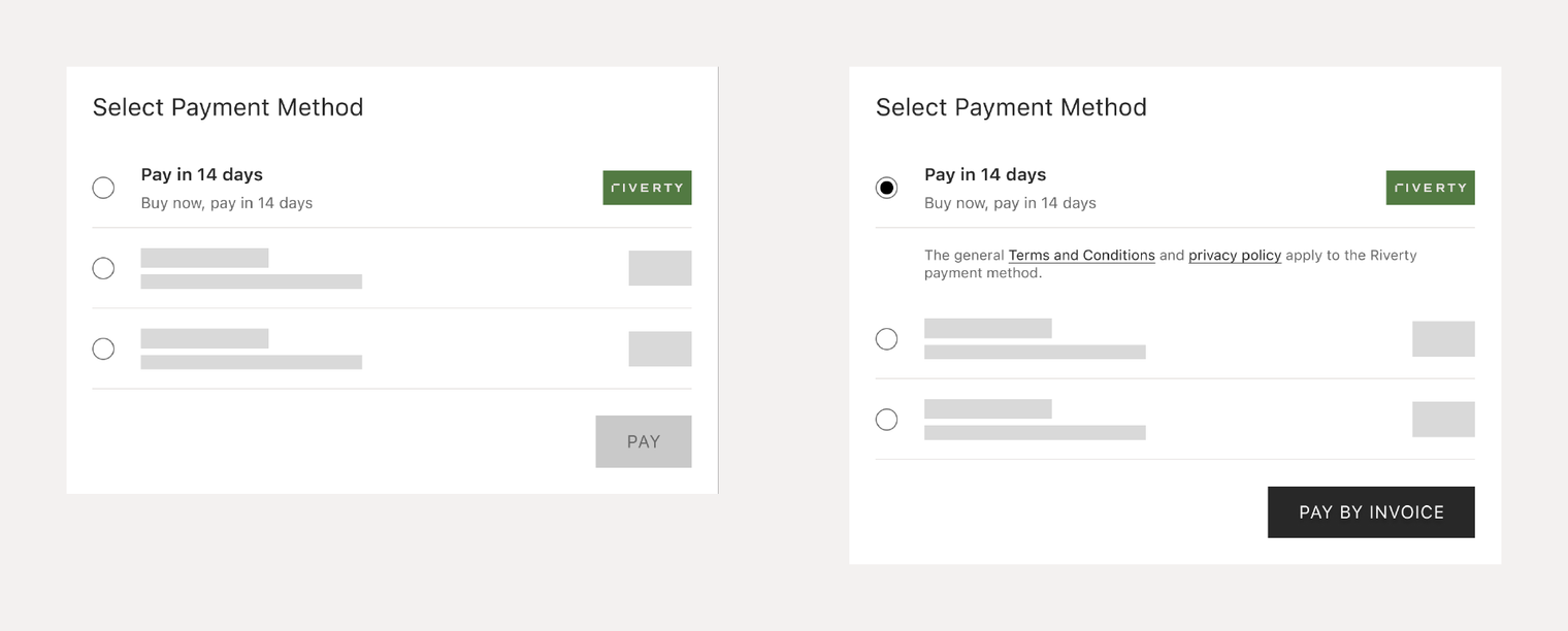
Show your customers that Riverty's payment methods are available at checkout. Ensure desired payment methods are clearly visible to retain customers.
- For an overview please visit Riverty's checkout best practices.
- Use our Primary or Secondary Badge. You can find them here

Featuring Riverty in the Payment Footer
Place a payment footer at the bottom of every page to show the logos for all available payment methods. Use our Riverty Badge together with other brands' acceptance marks in the footer for a clean and organized presentation.
A payment footer is useful for customers as it provides a quick and clear overview of all available payment methods, enhancing their confidence in the checkout process. It also streamlines the purchasing experience by making it easy for customers to see and select their preferred payment option.
- Use our Primary or Secondary Badge. You can find them here

Setting up your FAQ
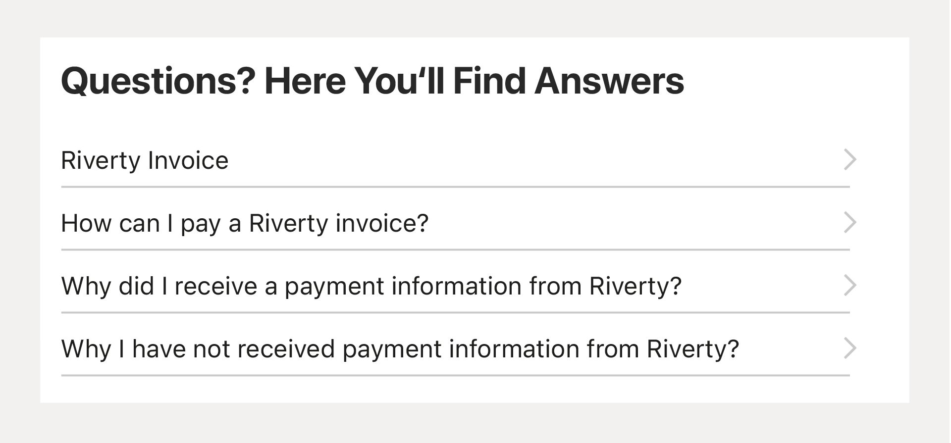
Ensure your customers can easily find answers to frequently asked questions about available payment methods by keeping your information updated and accessible.
- Visit our FAQ for Consumers Page for many answers, and feel free to link to our site.

Do you find this page helpful?
